The day before our new TeamBonding website went live I was on a call with a potential strategic partner who said,
“I just love your website, the colors, the design, the overall feel and it is the best one I have seen from a team building company.”
On a typical day this conversation would make me feel proud as we put a lot of time into developing and maintaining the website, but the newly designed site was going up the next day so I got a little nervous and I started questioning myself. Was the new design necessary? Did the new site have the fun and interaction of the current site? Would people like it and most of all would it work? Does the new website show the team effort that went into the production?
The Goal
The goals for this website redesign were different than any goals we’ve set in the past and we had what I would consider an all-star ‘A’ team of people working on all aspects of the site. Our aim was not only to get more people to the webs
The Strategy
The first call was to Acceleration Partners (AP), which is owned by Robert Glazer. I met Bob as President of the Boston chapter of EO, Entrepreneurs Organization. Bob’s company was an INC 500 company again, much higher on the list than TeamBonding was on the Inc. 5000. His team of designers and analysts did an extensive review and heat map of the website to find out what part of the site people used so that we could focus on what was important to our audience.
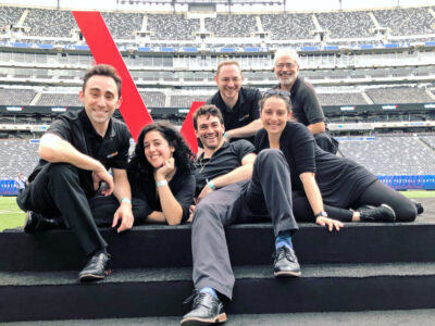
I also caught a lucky break with my friend Michael Dukes, currently Creative Director at Red Pepper in Nashville and the original copywriter for TeamBonding from many years ago, as he was able to give us some quality hours fine-tuning the voice of the site so that our message is clear and the fun and purpose come out in the copy. In addition, Colin, our SEO writer, has been back on the team so people can continue to find our site. Our graphic designer Sarah helped change some of the design elements including the logo with our new tagline. Cabe, our website developer, and Merove and Joanne, from AP, worked on the overall design and functionality of the site. This talented group was a virtual team effort consisting of people from Chicago, Ontario, St. Augustine, Sarasota, San Francisco, Nashville, and Boston.
The Outcome
Samantha McDuffee, our Director of Marketing, and I put in hundreds of hours creating new content, adding photos, editing blogs and testing the site. Lori helped by adding over 350 testimonials from happy clients. We added new sections like the CSR and a new category for Escape Game and Live-Action Adventures. The new site is now up and so far the site has been well-received, but like our business this team effort took a leap of faith and a belief that although we had a website that everyone loved, we could do better. I hope you like it as I have been told this is only Phase One. Stay tuned for a full outline of new featured and a look ahead at what’s to come.

